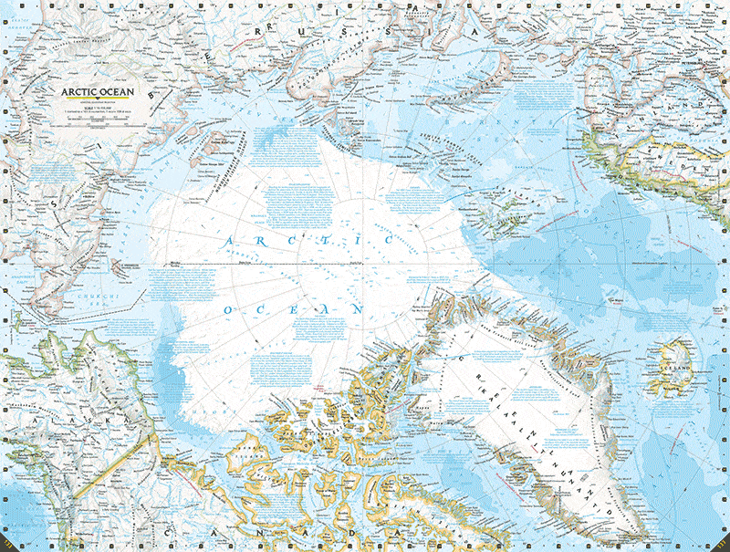
Every five years for more than a century, National Geographic releases an atlas of the world complete with the latest geographic and geologic cartographic representations. The latest edition of Atlas of the World can be quite terrifying if you move up north, in the Arctic, for it shows just how dramatic ice loss has been in the past decades. For comparison, the GIF above stitches three edition (7th and 10th) from 2000 to 2015. The latest caption shows the Arctic as it had been in 2012, during its record low ice extent.
Some have criticized National Geographic for its choice of representing the Arctic. The reason why the editor chose 2012, and not 2013 or 2014, was to remind people that the world is going through tough times and the effects of global warming are not as subtle as we might think. They’re very much real.
Subscribe to our newsletter and receive our new book for FREE
Join 50,000+ subscribers vaccinated against pseudoscience
By subscribing you agree to our
Privacy Policy. Give it a try, you can unsubscribe anytime.
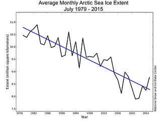
The sea ice extent of September 2012 was 56% lower than that in the same period of 2000, and 65% lower than 1975. The graph on the right shows how sea ice extent has evolved along the years.
“Throughout its geological history, the Earth’s climate has changed numerous times – there were times when there were no polar ice caps at all, and there were times when most of the Earth was frozen. But the key word here is “geological” – all these changes occurred over hundreds of thousands of years, if not millions. The climatic changes we are now witnessing are, according to the geological record, unprecedented in terms of speed; we are just now starting to understand the dramatic impact that this temperature shift is having.”
Original Text (This is the original text for your reference.)
Every five years for more than a century, National Geographic releases an atlas of the world complete with the latest geographic and geologic cartographic representations. The latest edition of Atlas of the World can be quite terrifying if you move up north, in the Arctic, for it shows just how dramatic ice loss has been in the past decades. For comparison, the GIF above stitches three edition (7th and 10th) from 2000 to 2015. The latest caption shows the Arctic as it had been in 2012, during its record low ice extent.
Some have criticized National Geographic for its choice of representing the Arctic. The reason why the editor chose 2012, and not 2013 or 2014, was to remind people that the world is going through tough times and the effects of global warming are not as subtle as we might think. They’re very much real.
Subscribe to our newsletter and receive our new book for FREE
Join 50,000+ subscribers vaccinated against pseudoscience
By subscribing you agree to our
Privacy Policy. Give it a try, you can unsubscribe anytime.
The sea ice extent of September 2012 was 56% lower than that in the same period of 2000, and 65% lower than 1975. The graph on the right shows how sea ice extent has evolved along the years.
“Throughout its geological history, the Earth’s climate has changed numerous times – there were times when there were no polar ice caps at all, and there were times when most of the Earth was frozen. But the key word here is “geological” – all these changes occurred over hundreds of thousands of years, if not millions. The climatic changes we are now witnessing are, according to the geological record, unprecedented in terms of speed; we are just now starting to understand the dramatic impact that this temperature shift is having.”
Disclaimer: The translated content is provided by third-party translation service providers, and IKCEST shall not assume any responsibility for the accuracy and legality of the content.


 User Center
 My Training Class
 Feedback


 Some have criticized National Geographic for its choice of representing the Arctic. The reason why the editor chose 2012, and not 2013 or 2014, was to remind people that the world is going through tough times and the effects of global warming are not as subtle as we might think. They’re very much real.


Comments
Something to say?
Log in or Sign up for free